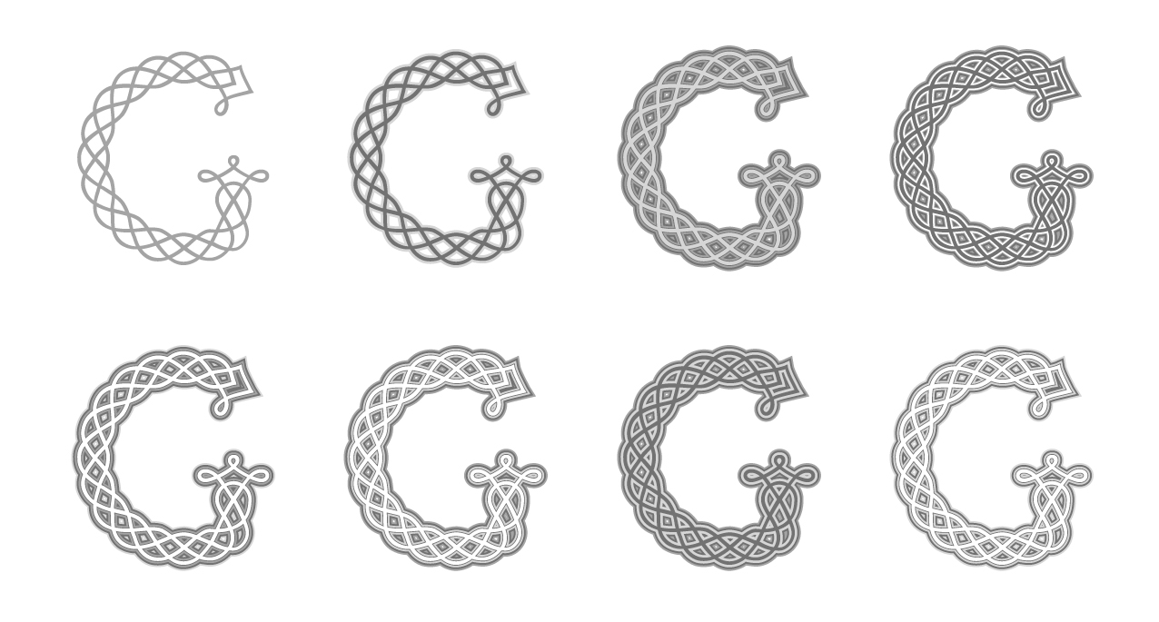
Pdf specimen of the typeface Chapitre
Award
Type Directors Club Certificate of Excellence in Type Design of New York
![]()
Buy Chapitre font at ILT — from $32

Pdf specimen of the typeface Chapitre
Award
Type Directors Club Certificate of Excellence in Type Design of New York
![]()
The typeface Chapitre is based on the principle
of the endless knot, a symbol used particularly in Hinduism and Buddhism. As its name implies,
an endless knot has no beginning and no end.
Similar ornaments and patterns can be found in many other cultures at different times in history: Early Christian Ethiopian frescoes and bas-reliefs, Irish and Anglo-Saxon illuminations of the Middle Ages, Girih in Islamic art in the 11th and 12th centuries or Flemish calligraphy of the 17th century.
The letters of Chapitre are not strictly endless knots; most of them consist of two or three layered lines. However, they visually convey the ideas
of intertwining, unity and inseparability which are characteristic of endless knots.
Although the construction of the letters is complex, special attention was given to achieving a high level of readability. Chapitre contains more than 250 glyphs and offers extensive language support. The typeface was designed to perform optimally when used between 30 and 45 points.
Designer: Jonathan Fabreguettes
References: take a look at the Pdf specimen of the typeface Chapitre.
Thanks to Mark Jamra for his editorial assistance with this text.
NEWSLETTER
MASTODON
CONTACT