Pdf specimen of the typeface Joos
Award
Type Directors Club Certificate of Excellence in Type Design of New York
![]()
Buy Joos fonts at ILT — from $32
Pdf specimen of the typeface Joos
Award
Type Directors Club Certificate of Excellence in Type Design of New York
![]()
Joos Lambrecht, from Ghent, is one of the first important printers and punchcutters of the sixteenth century. He criticized frankly the reading habits and the typographical preferences of the Dutch and Flemish readers at that time. Since 1530 he tried to promote the use of roman types to replace blackletter types, with little success.
Lambrecht cut many roman types which he tried to distribute to other printers, but also a remarkable upright italic of which he was the only user. It is this italic which inspired the Joos typeface.
This work is not a formal revival of Lambrecht’s work, but faithfully fit into the scheme of its thought, which was to idealize roman types by bringing together the characteristic graceful shapes of italics and the angle of romans. Joos takes its inspiration in the principles of classical italics such as those of Francesco Griffo, but also from more contemporary shapes.
In order to make the character optically vertical, it was necessary to work on each sign with a specific angle, which was defined notably by its structure and dimension. Capitals, in accordance with Lambrecht’s idea, all have a geometrical vertical stem, while the lowercases have an angle which vary between 0 and 2 degrees.
Joos offers a wide typographical range of use and flexibility: ligatures, alternates, stylistic sets, OpenType functionalities, oldstyle figures, small caps for the Pro version…
Fixed in a history, Joos is still a contemporary typeface, from both a technical and aesthetic point of view.
Designer: Laurent Bourcellier (revival)
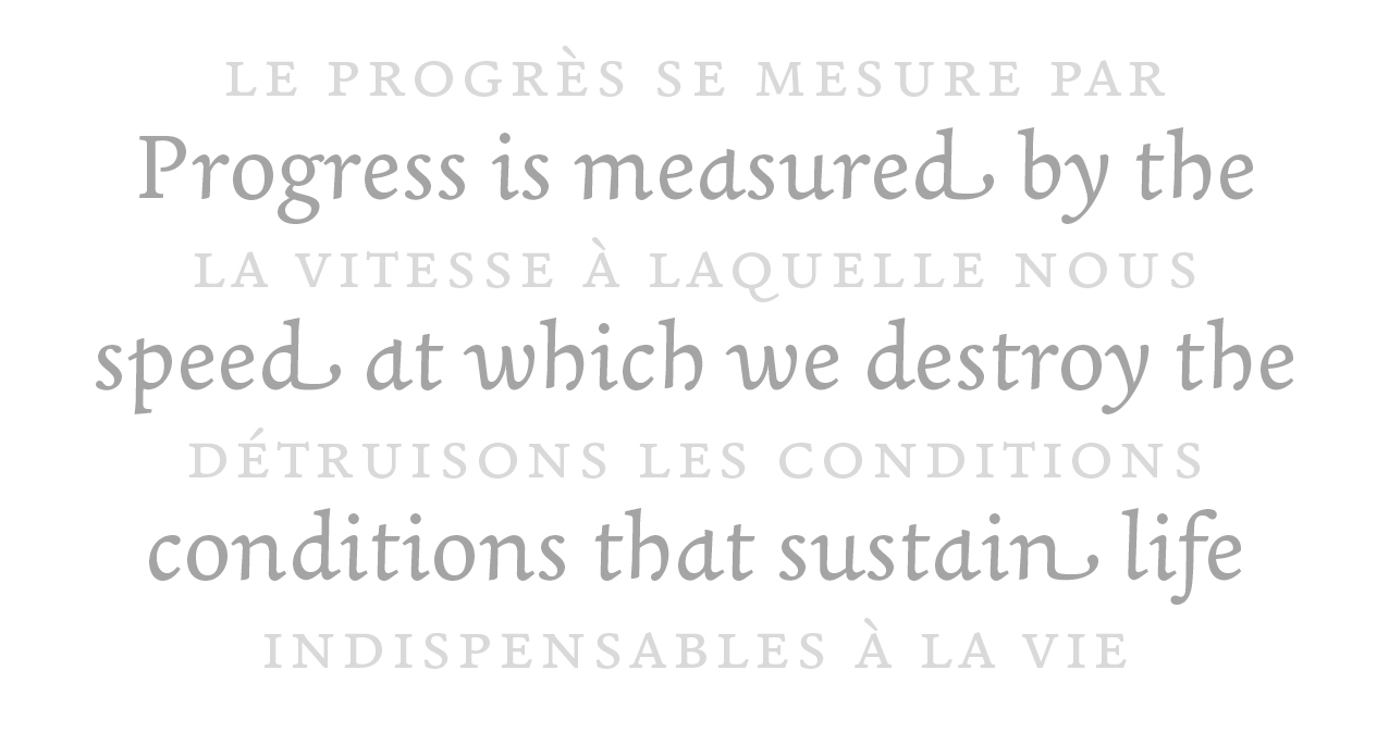
Quotation from George Monbiot.
If you previously purchased the "Classic" version of Joos, you can receive the "Pro" version for free: please contact us.
NEWSLETTER
MASTODON
CONTACT